
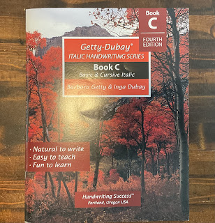
I have observed that few subjects in a primary curriculum are as satisfying as the development of a refined, elegant script, and Italic Handwriting Book C has proven to be an exceptional instrument for this purpose. We have consistently utilized the Getty-Dubay series for our handwriting instruction, primarily because the resulting penmanship is remarkably aesthetic and legible. As the nomenclature suggests, the style incorporates a slight slant, lending it a sophisticated, professional appearance. To maximize the utility of this resource, I have implemented a strategic "mom-hack": I utilize high-quality sheet protectors over the pages, allowing my daughter to engage in repetitive practice without depleting the physical workbook. This ensures a level of mastery that simply cannot be achieved by a single pass through the material.


The pedagogical progression of the series is quite impressive. While Books A and B utilize specialized "kid-friendly" ruled paper, Book C introduces a subtle transition by gradually reducing the line size as the student advances. This effectively prepares the student for standard notebook paper, moving away from the restrictive top, middle, and bottom guides of early childhood. The workbook initiates the academic year with a pre-test to establish a baseline for the student’s proficiency and concludes with a post-test to quantify their growth. I particularly appreciate the opening review of "letter families," which clusters characters based on their formation strokes, allowing for a more logical and systematic approach to lowercase and uppercase mastery.

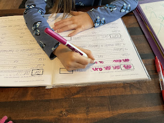
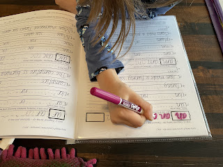
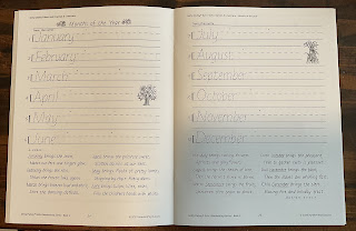
Beyond the basic alphabet, the curriculum integrates practical literacy skills, including a dedicated section for numerical digits and their corresponding written forms. While the physical space for practicing these is somewhat limited, my sheet-protector strategy effectively negates this constraint, permitting limitless repetition. I was also pleasantly surprised to find sections dedicated to the days of the week, the months of the year, and the seasons. Since our core curriculum lacked a formal instructional block for these temporal concepts—necessitating that I teach them via our family calendar—their inclusion here serves as a welcome reinforcement of essential real-world knowledge.

The most anticipated milestone in Book C is undoubtedly the introduction of cursive, which occurs approximately midway through the volume. The Getty-Dubay method is uniquely efficient; it treats cursive as a natural extension of italic print, primarily by adding "serifs" or tails to connect the characters. Interestingly, at this stage, the curriculum does not mandate that every letter in a word be interconnected, which may seem anomalous to those accustomed to traditional, ornate cursive styles. However, upon investigating Book D, it is clear that this is a deliberate, tiered introduction designed to build confidence before the student navigates the more complex flow of fully connected script.

The workbook concludes with a brief demonstration of looped cursive—a style I am perfectly content to leave as a visual reference rather than a practiced requirement. I hold this curriculum in high regard and consider it a premier choice for any homeschooler seeking to cultivate a graceful hand. A final administrative note for the discerning parent: the publisher maintains a strict policy against photocopying, so if you wish to benefit from the repetition that leads to true muscle memory, the sheet-protector method is your most ethical and effective solution. We secured our copy as part of our comprehensive English studies. I am curious to learn from the community: what script do you prefer for your scholars—traditional cursive, or a modern italic?

Comments
Post a Comment